What kind of colours suit you?

Understanding Color Theory in Fashion
Color is one of the most powerful elements in fashion, influencing not only the aesthetics of an outfit but also how we feel and how others perceive us. Color theory examines how colors interact, complement each other, and affect our overall style. Whether you’re a fashion enthusiast refining your wardrobe or someone curious about what colors to wear, mastering color theory can transform your approach to fashion.
In this post, we’ll explore the fundamentals of color theory, including the color wheel, color harmony, and the psychological effects of different hues. We’ll provide practical tips on how to use color effectively in your wardrobe, from selecting the right shades for your body type to incorporating seasonal trends. By understanding these principles, you’ll be well-equipped to make informed and confident style choices, creating outfits that not only look great but also resonate with your personal taste.
Ready to dive into the vibrant world of color and discover what colors to wear? Let’s get started!
Basics of Color Theory
Color Wheel: The Foundation of Fashion Color
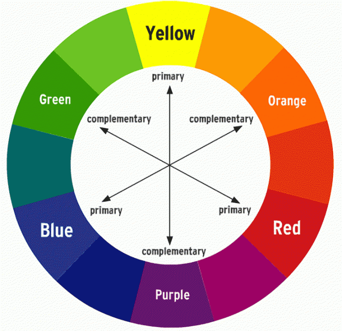
Understanding the color wheel is essential for mastering fashion design and styling. It consists of primary, secondary, and tertiary colors:
- Primary Colors: Red, blue, and yellow are the building blocks of all other colors. In fashion, these colors serve as the foundation for creating vibrant and impactful outfits.
- Secondary Colors: Formed by mixing two primary colors, secondary colors include green, orange, and purple. These colors often add depth and variety to a wardrobe, providing options for creating balanced and interesting ensembles.
- Tertiary Colors: Created by mixing a primary color with a secondary color, tertiary colors like red-orange and blue-green offer a broader spectrum of hues. You can create nuanced and sophisticated looks with these colors.
Color Harmony: Crafting Cohesive and Stylish Outfits
Color harmony is about creating aesthetically pleasing combinations that enhance your fashion choices. Here are some key color schemes to consider:
- Complementary Colors: These are colors located directly opposite each other on the color wheel, such as blue and orange or red and green. Using complementary colors in your outfits creates high contrast and visual interest, making each color pop.
- Analogous Colors: These are colors that sit next to each other on the color wheel, like blue, blue-green, and green. Analogous color schemes offer a harmonious and serene look, perfect for creating cohesive and understated outfits.
- Triadic Colors: This scheme involves three colors evenly spaced around the color wheel, such as red, yellow, and blue. Triadic color combinations provide a vibrant and balanced palette, ideal for adding energy and excitement to your wardrobe.
- Monochromatic Colors: This approach uses variations of a single color, such as different shades of blue. Monochromatic outfits create a sleek and sophisticated look, emphasizing texture and layering rather than color contrast.
By understanding and applying these color theory principles, you can elevate your fashion sense and create outfits that are not only stylish but also visually captivating. Whether you’re designing a new collection or simply putting together your next look, mastering color harmony will help you make a bold and cohesive statement.
Color Psychology in Fashion
Emotional Impact: The Power of Color on Feelings
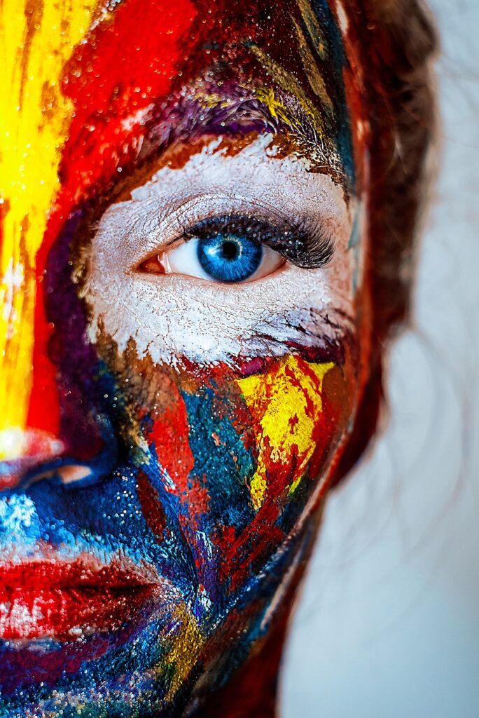
Colors have a profound effect on our emotions and can significantly influence the way we feel and how others perceive us. In fashion, understanding these emotional impacts can help you create outfits that convey the right mood and message:
- Red: Often associated with passion, energy, and excitement, red is a powerful color that can evoke strong emotions. Wearing red makes you stand out, but it also gives an aggressive impression if you don’t balance it correctly.
- Blue: Blue, with its calming and serene qualities, evokes feelings of tranquility and trust. It’s a great color for creating a soothing and professional look, making it ideal for business settings or casual wear.
- Yellow: This color represents happiness, optimism, and creativity. Wearing yellow can brighten your mood and attract positive attention.
- Green: Representing nature, growth, and balance, green is a color that conveys a sense of renewal and stability. It’s perfect for creating a relaxed and grounded look, and it often brings a fresh and vibrant touch to your outfit.
- Purple: Purple symbolizes luxury, mystery, and creativity. It’s a sophisticated color that can make a statement and add a touch of elegance to your wardrobe.
- Black: Symbolizing sophistication, power, and elegance, black is a versatile color that can be both formal and edgy. It’s a staple in fashion for creating sleek and timeless looks.
- White: Often associated with purity, simplicity, and new beginnings, white is a color that conveys a clean and fresh appearance. It’s ideal for creating a minimalist and classic style.
Cultural Associations: Colors Across Cultures
Colors carry different meanings and significance depending on cultural context. Here’s a glimpse into how colors are perceived around the world:
- Red: Western cultures associate red with love and danger, while in China, it symbolizes good fortune and joy. In Indian culture, red represents prosperity and celebration.
- Blue: Many cultures link blue to calmness and stability. In parts of the Middle East, blue represents protection and healing.
- Yellow: Western cultures view yellow as cheerful and warm, but in some Asian cultures, it signifies caution or dishonesty. In Japan, yellow symbolizes courage and strength.
- Green: Globally, people associate green with nature and fertility. In Western cultures, green can also symbolize envy, while in Islamic culture, it represents paradise and spirituality.
- Purple: Many cultures traditionally associate purple with royalty and wealth. In some Asian cultures, purple signifies mourning or sadness, but generally, it represents honor and dignity.
- Black: Western cultures typically connect black with mourning and formality. In many African cultures, black symbolizes maturity and spirituality, while in some Asian cultures, it signifies wealth and power.
- White: Western cultures often link white to purity and weddings, while in some Eastern cultures, it represents mourning and funerals.
By understanding color psychology and cultural associations, you can make informed fashion choices that not only enhance your style but also resonate with your personal and cultural values. Embrace the power of color to express yourself and connect with others on a deeper level.
Using Color in Fashion
Color Matching: Tips for Combining Colors Effectively
Mastering color matching brings harmony and style to any outfit. Here are some practical tips:
- Stick to a Color Scheme: Start with a defined color palette. Whether you go for complementary, analogous, or triadic colors, staying within a scheme ensures your outfit looks cohesive.
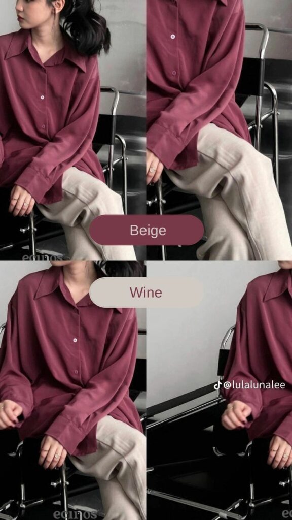
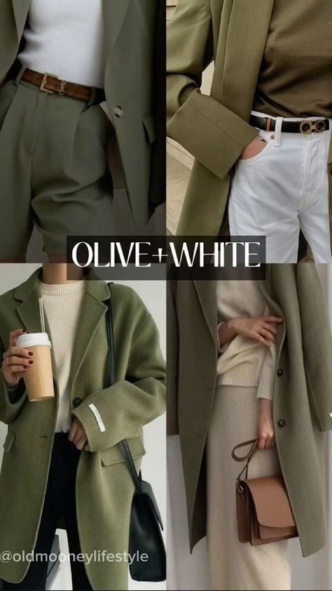
- Balance Bold Colors with Neutrals: Use neutrals like black, white, gray, or beige to balance bold colors. Pair a vibrant piece with neutral tones to avoid overwhelming the eye while letting your statement color shine.
- Play with Textures and Patterns: When combining colors, consider the textures and patterns of your clothing. A monochromatic outfit with varied textures creates depth, while patterns can either harmonize or contrast, depending on your choice.
- Use the 60-30-10 Rule: Apply the 60-30-10 rule for a balanced look. Make 60% of your outfit a dominant color, 30% a secondary color, and 10% an accent color. This rule helps create visually appealing outfits without too much effort.

Seasonal Colors: How Color Trends Vary with Seasons
Seasons influence color choices, bringing different shades and tones to the forefront:
- Spring: Spring favors soft, pastel colors like light pink, baby blue, and mint green. These colors reflect the season’s fresh and vibrant energy, perfect for lighter fabrics and breezy styles.
- Summer: In summer, bold and bright colors dominate, including coral, turquoise, and lemon yellow. These vibrant hues capture the warmth and liveliness of the season, ideal for creating fun and energetic looks.
- Autumn: Autumn invites earthy tones like burnt orange, olive green, and deep burgundy. These rich colors mirror the changing leaves and add warmth and depth to your wardrobe, making them perfect for layering.
- Winter: Winter calls for darker and more muted colors, such as navy blue, charcoal gray, and deep red. These colors convey elegance and sophistication, often paired with heavier fabrics and structured silhouettes.
Body Types and Colors: Choosing Colors to Complement Your Shape
Choosing the right colors enhances your natural shape and boosts your confidence:
- For Hourglass Figures: Highlight your curves with bold and contrasting colors. Use darker shades on areas you want to downplay and brighter ones where you want to draw attention. For example, a bright top with a darker skirt balances proportions.
- For Pear-Shaped Bodies: Balance wider hips with brighter colors on top and darker shades on the bottom. This technique draws the eye upward, creating a more balanced silhouette.
- For Apple-Shaped Bodies: Opt for darker colors on top to create a slimming effect, and use lighter or brighter colors on the bottom to shift focus away from the midsection. V-necklines and monochromatic outfits also elongate the torso.
- For Rectangular Figures: Create the illusion of curves by using color-blocking techniques. Wear contrasting colors at the waist or opt for belts in a bold shade to define your waistline.
Practical Application of Color Theory in Fashion
Outfit Ideas: Examples Based on Color Theory Principles
Applying color theory to your wardrobe unlocks endless possibilities for stylish and cohesive outfits. Here are some examples:
- Complementary Outfit: Pair a royal blue blouse with an orange skirt. The high contrast between these complementary colors creates a bold and eye-catching look, perfect for making a statement. For inspiration, check out how celebrities pull off similar combinations on our Celebrity Looks page.
- Analogous Outfit: Combine a soft green sweater with a teal scarf and olive pants. This harmonious color scheme offers a serene appearance, ideal for a relaxed and stylish day out.
- Monochromatic Outfit: Choose a range of shades within a single color family, like a light gray turtleneck with charcoal gray trousers and a slate gray jacket. This monochromatic approach creates a sleek, sophisticated look that emphasizes texture and layering. Discover more monochromatic celebrity outfits on our Celebrity Looks page.
- Triadic Outfit: Mix and match three colors evenly spaced on the color wheel, such as a yellow top, blue skirt, and red shoes. This triadic scheme produces a vibrant and balanced outfit, perfect for those who love to experiment with color.
- Seasonal Outfit: Embrace autumn with an outfit featuring warm, earthy tones. Combine a burnt orange sweater with deep burgundy pants and a mustard-yellow scarf. This color palette reflects the richness of the season while keeping your look cozy and stylish.
Incorporate these outfit ideas into your wardrobe, and visit our Celebrity Looks page for more inspiration from the stars.
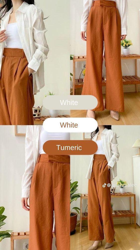
Color Swatches: Tools and Resources for Selecting and Visualizing Colors
Selecting the right colors for your outfits becomes easier with the right tools and resources. Here are some practical ways to visualize and choose colors:
- Digital Color Palettes: Use online tools like Adobe Color, Coolors, or Canva to create and experiment with color palettes. These platforms allow you to generate and save custom color schemes, making it easier to plan outfits or design a wardrobe.
- Physical Swatches: Invest in a set of physical color swatches or a color fan deck, like those used in interior design. Carry these with you when shopping to match clothing items or to help visualize how different colors will look together.
- Color Matching Apps: Apps like Pantone Studio, ColorSnap, or SwatchMate let you capture and match colors from real-world objects. Simply take a photo, and the app will generate a color palette, helping you find matching clothing items or accessories.
- Wardrobe Planning Tools: Use wardrobe planning apps like Stylebook or Cladwell, which incorporate color theory into outfit planning. These apps allow you to organize your wardrobe by color, create outfits, and track what you wear, making color coordination effortless.
By incorporating these outfit ideas and tools into your fashion routine, you can confidently apply color theory to create visually stunning and harmonious looks. Whether you’re experimenting with new color combinations or planning your seasonal wardrobe, these resources will help you achieve a polished and stylish appearance.
Common Mistakes in Color Theory Application
Color Conflicts: Common Errors to Avoid
Avoid clashing colors that disrupt the harmony of your outfit. Combining colors that are too similar in tone or too close on the color wheel can create a dull look. Conversely, pairing colors that clash, like bright pink and neon green, can overwhelm the eyes. Stick to proven color schemes like complementary, analogous, or triadic combinations for a balanced appearance.
Overuse of Trends: Balancing Trendy Colors with Timeless Pieces
While trendy colors can refresh your wardrobe, overusing them may date your outfits quickly. Balance trendy shades with timeless, neutral pieces like black, white, or beige. This approach allows you to stay fashionable while ensuring your wardrobe remains versatile and long-lasting. For ideas on balancing trends, explore our Wardrobe Essentials page.
Conclusion
Summary
You’ve learned the basics of color theory, including the color wheel, color harmony, and how different colors evoke emotions. We also covered how to apply these principles to fashion, with practical outfit ideas, tools for color selection, and common mistakes to avoid. Understanding and applying color theory enhances your style, allowing you to create cohesive, visually appealing outfits.
Call to Action
Now it’s time to put this knowledge into action. Experiment with different color combinations and see how they transform your fashion choices. Don’t be afraid to mix and match colors to find what works best for you. Visit our pinterest Color Combos guide!
Additional Resources
Further Reading
- “The Secret Lives of Color” by Kassia St. Clair
Explore the history and cultural significance of colors in this engaging book. Read more on Amazon. - “Color: A Natural History of the Palette” by Victoria Finlay
Discover the stories and origins behind various colors with this detailed account. Read more on Amazon. - “Interaction of Color” by Josef Albers
A classic text on color theory and its practical applications in art and design. Read more on Amazon. - “Color Theory: An Essential Guide to Color-from Basic Principles to Practical Applications” by Patti Mollica
An accessible guide that covers fundamental color theory principles and their use in art and design. Read more on Amazon. - “The Art of Color: The Subjective Experience and Objective Rationale of Color” by Johannes Itten
Delve into the subjective and objective aspects of color with this comprehensive study. Read more on Amazon.
You can explore these books for a deeper understanding of color theory and its application.
Tools
- Adobe Color: Create and experiment with color palettes effortlessly.
- Coolors: A user-friendly tool for generating beautiful color schemes.
- Pantone Studio: Capture and match colors from real-world objects.
Pingback: Celebrity Styles - Xcrym